Special Notes:
Listen to our L&L lectures online: WHRI Lunch & Learn Series – Women’s Health Research Institute
Visit our Stats corner in the e-blast for previously published tips on data management and analysis: E-Blast Archive – Women’s Health Research Institute (whri.org)
We are back! Today, we dive deep into one of the most fundamental yet powerful tools in data visualization and analysis – the box plot. Whether you are a seasoned data scientist or a novice exploring the world of data, understanding box plots can significantly enhance your data interpretation skills.
What is a Box Plot?
A box plot, also known as a box-and-whisker plot, is a standardized way of displaying the distribution of data based on a five-number summary: minimum, first quartile (Q1), median, third quartile (Q3), and maximum. It is particularly useful for identifying outliers and understanding the spread and skewness of the data.
Components of a Box Plot:
Minimum (Q0): The smallest data point excluding outliers.
First Quartile (Q1): The median of the lower half of the dataset.
Median (Q2): The middle value of the dataset.
Third Quartile (Q3): The median of the upper half of the dataset.
Maximum (Q4): The largest data point excluding outliers.
Visual Elements:
Box: The box spans from Q1 to Q3, with a line at Q2 (the median). This range (Q1 to Q3) is known as the interquartile range (IQR).
Whiskers: Lines extending from the box to the minimum and maximum values within 1.5 * IQR from Q1 and Q3, respectively.
Outliers: Data points outside the whiskers are plotted as individual points and are considered potential outliers.
Why Use Box Plots?
Comparison: Box plots are excellent for comparing distributions across different categories or groups.
Outlier Detection: Easily identify outliers that may need further investigation.
Data Spread: Understand the spread and central tendency of your data quickly.
Skewness: Determine the skewness of your data distribution.
How to Interpret a Box Plot
Median Line: The line inside the box shows the median. If it’s not centered, it indicates skewness.
Box Size: The size of the box shows the IQR. A larger box indicates more spread in the middle 50% of the data.
Whiskers: The length of the whiskers can give you an idea of the variability outside the central range.
Outliers: Points outside the whiskers highlight potential outliers that may need special attention.
Examples of Practical Applications
Quality Control: Box plots are used in quality control processes to monitor process variations.
Research: Widely used in academic research for statistical analysis.
Business Analytics: Businesses use box plots to compare sales performance, customer satisfaction scores, etc.
Healthcare: In healthcare, box plots can help in visualizing patient data, treatment effects, and more.
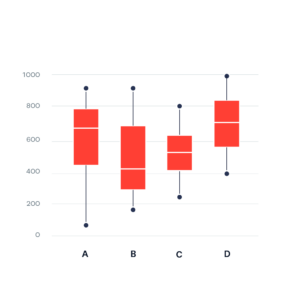
Box plot example:
Box Plot Explained with Examples – Statistics By Jim
Conclusion
Box plots are a versatile and powerful tool in data analysis. They provide a clear summary of data distribution and are particularly useful in comparing different datasets. As you continue your data journey, mastering box plots will undoubtedly enhance your analytical capabilities.
I use it a lot, especially during the exploratory stage of data analysis!
Good luck with your Statistics adventure!
Contact Sabina for statistics help or questions here: sabina.dobrer@cw.bc.ca